Buttons
Our button components are designed for clear calls to action and consistent user interaction.
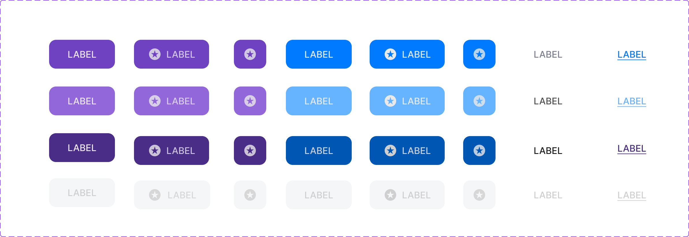
Button System Reference
Complete button design system with all variants and states
Dashboard Example
See how buttons work together in a real application interface
Dashboard
Total Projects
24
+12%
Active Users
1,429
+8%
Revenue
$12,450
+23%
Performance
94%
+5%
Analytics Overview
Chart visualization would go here
Recent Activity
New user registered
2 minutes ago
Project completed
1 hour ago
Payment received
3 hours ago
System backup completed
6 hours ago
3 items selected
Button Specifications
Detailed specifications for implementing the Violet Design System buttons
| Variant | Size | Default | Hover | Pressed | Disabled |
|---|---|---|---|---|---|
| Primary Label | 120×48px | #9747ff | #b366ff | #4a2d87 | #e9e9e9 |
| Primary Icon+Label | 140×48px | #9747ff | #b366ff | #4a2d87 | #e9e9e9 |
| Primary Icon | 48×48px | #9747ff | #b366ff | #4a2d87 | #e9e9e9 |
| Secondary Label | 120×48px | #007bff | #66b3ff | #0056b3 | #e9e9e9 |
| Secondary Icon+Label | 140×48px | #007bff | #66b3ff | #0056b3 | #e9e9e9 |
| Secondary Icon | 48×48px | #007bff | #66b3ff | #0056b3 | #e9e9e9 |
| Ghost | Variable | #535151 | #007bff | #0056b3 | #cfcfcf |
| Link | Variable | #535151 / #007bff | #007bff / #0056b3 | #0056b3 | #cfcfcf |
Design Guidelines
- • Border radius: 16px for all button variants
- • Font weight: Medium (500) for button text
- • Icon size: 16×16px (h-4 w-4) for all button icons
- • Text color: White for primary/secondary, variable for ghost/link
- • Transition: All states use 200ms ease transitions
- • Shadow: Subtle shadows on hover, inner shadow on pressed state